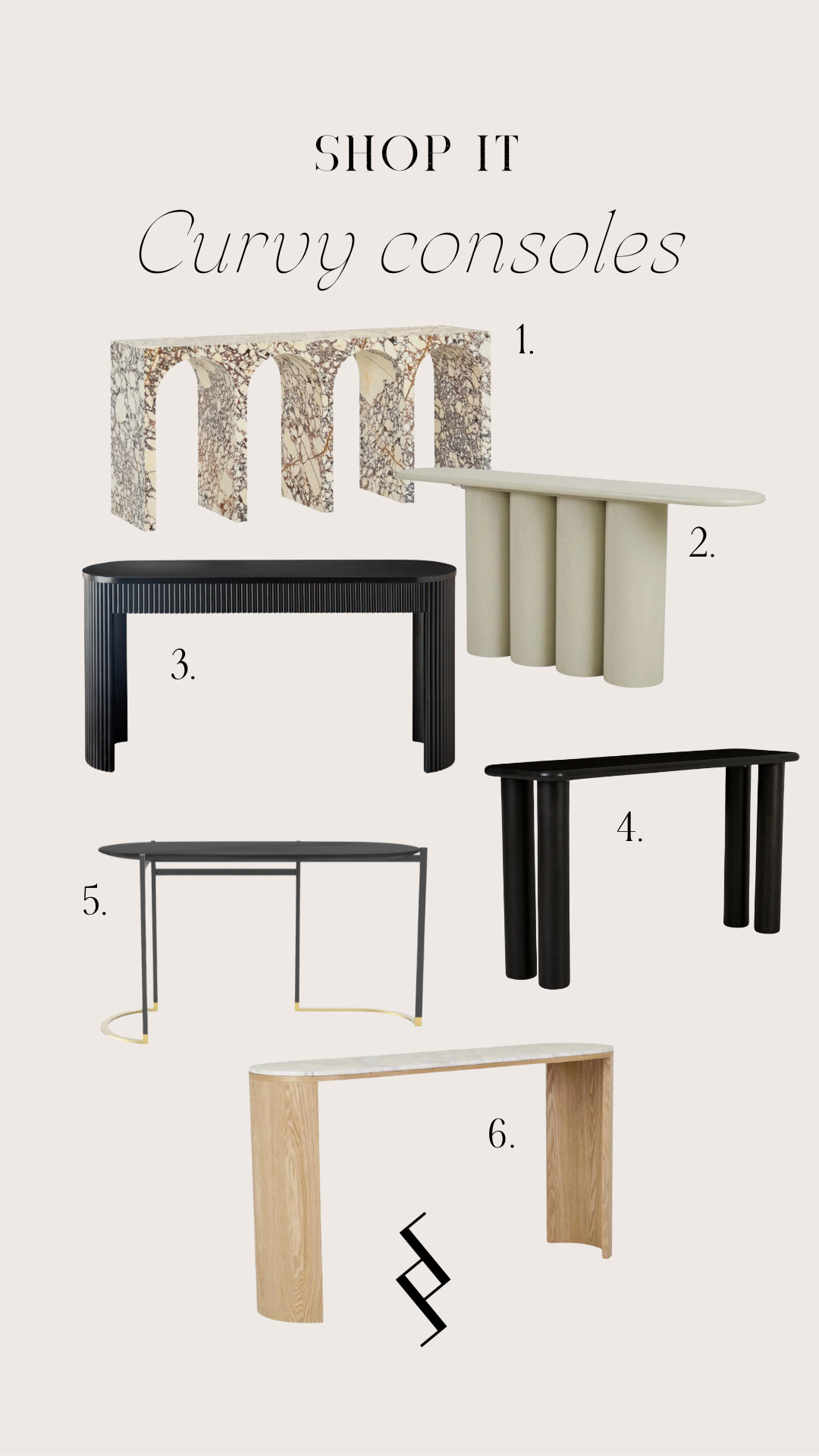
shop it / curvy consoles
The entranceway is one of my favourite areas to design and style. It may be small, large or somewhere in between but no matter the size, it’s the first introduction people get to the interior of your home. It’s like a business card; welcoming guests, setting the style and giving them a sense of the spaces they can expect within. A console is one of the most effective ways to add detail to your entranceway, and it also doubles as a handy shelf for purses or keys. Curved consoles have been catching my eye lately - they’re a unique way of adding an artistic element if everything else is formal, straight lines. Here are some tips to help you choose and style a curved console, plus a round-up of favourites.
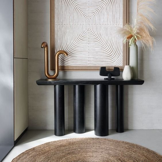
image via crate and barrell
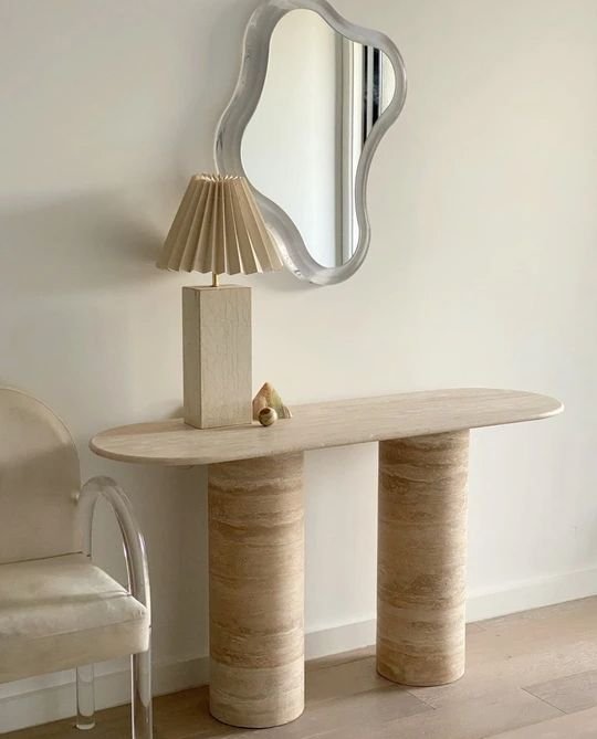
image via en gold
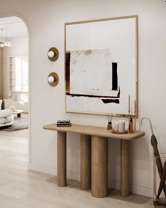
image via Brabbu
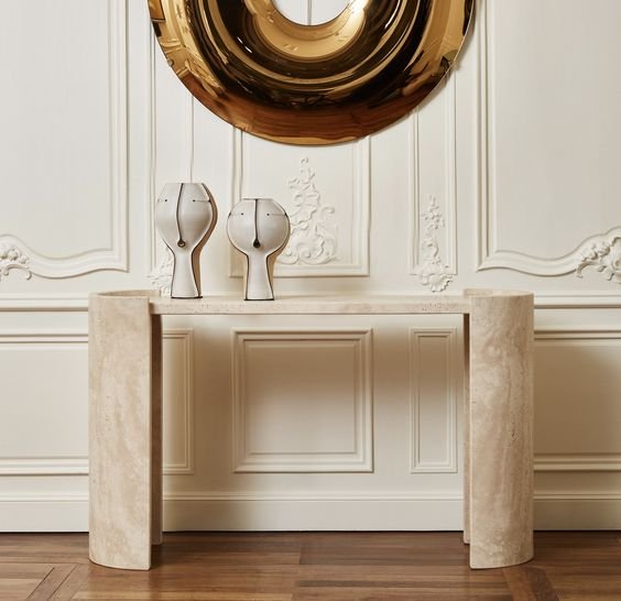
image via ta house
image via studio glastin
Scale is really important in an entranceway - anything too big will clutter the space and anything too small will look dinky. Measure the available space in your entrance area to determine the best size and check the piece doesn’t obstruct walkways or door swings.
Think of your console as a personal style statement and choose something with interesting details you love. It could be curved ends, the shape of the legs, a stone top or a vintage piece. Try to create at ‘look at me’ moment that makes you smile every time you open the door.
Often consoles have a large open gap underneath and it can help to add items to ground this space. My favourite trick is to use two small matching ottomans sitting in a symmetrical pair - these can also be used to take shoes on and off.
Adding a console will create a natural space for you to make a focal point. But to do this you want some design detail at eye level, above the console. See where the ends of the table are and think of all the space in the centre as design potential - I like to keep the console as the widest piece in the setting for balance. Decide what to add above - art or a mirror is a great option.
Place large accessories first. This could be a matching lamp on each end, a vase arrangement, a stack of books. I usually take one of two approaches - a symmetrical setting with taller items at each end or a taller item at one end with a grouping of shorter items at the other end to create more of a dynamic layered look.
Add lighting whether it’s matching lamps, one offset lamp, wall sconces either side of your art of candles. This gives a lovely welcoming glow for guests, and getting home at night to the low light of a lamp is both practical and comforting.
Then add smaller items like a bowl, sculptural item, and a tray for keys. A touch of nature adds texture and an organic element. My favourite arrangement is a large sculptural setting of branches or large blooms - I find it looks more striking than lots of little leaves.
Have fun experimenting with different arrangements until you’re happy with how the setting looks and feels - there’s no right or wrong here! You can also regularly update the display to suit the occasion or season.

