Kathryn Wilson Shoes / remuera store reveal
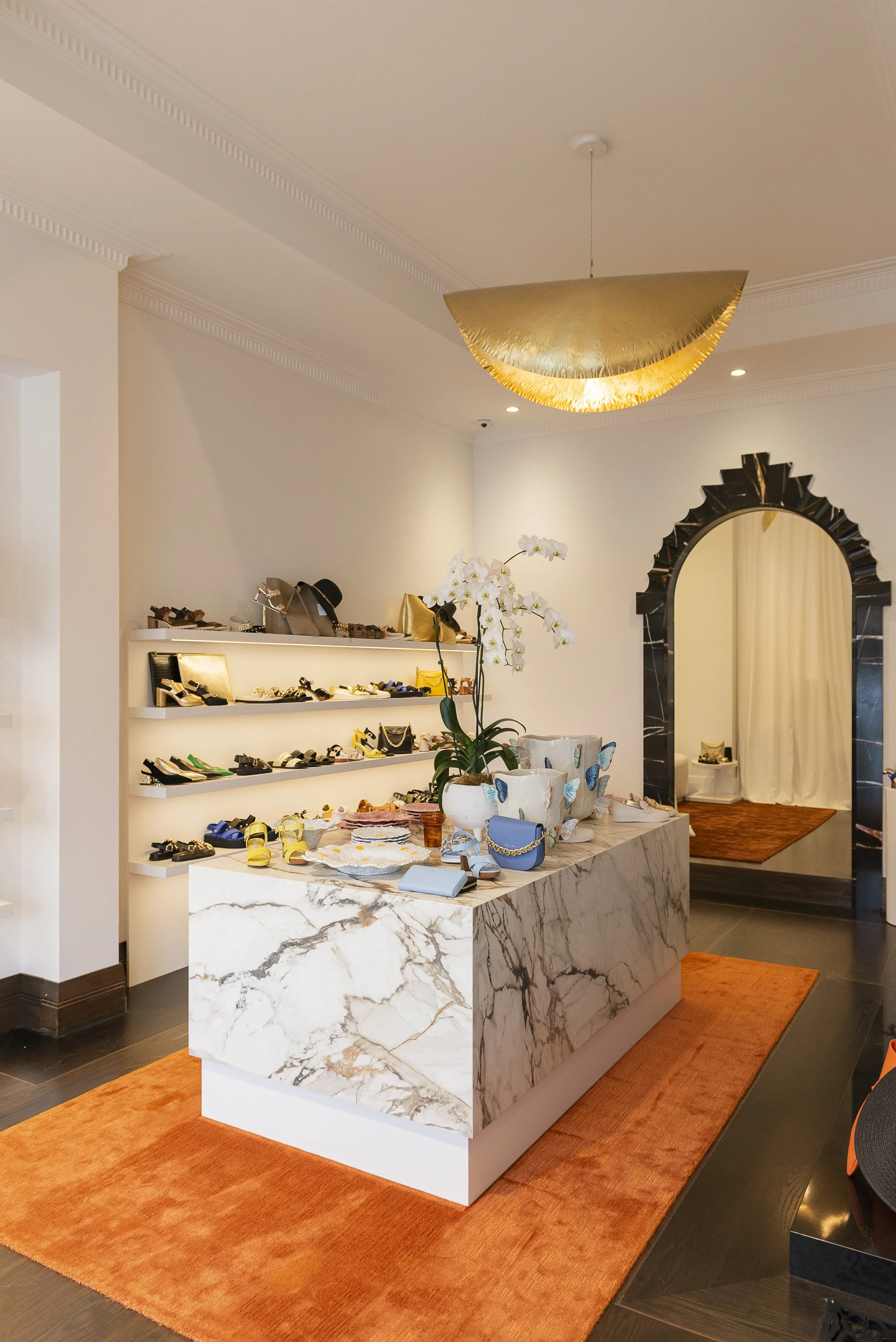
I recently worked on the interior design of Kathryn’s new shoe store in Remuera. The existing interior already had an elegance about it thanks to character details like high ceilings, moulded scotias and timber skirting boards. Kathryn wanted to keep the classic simplicity but add more wow factor for the stylish customers who come in to view her gorgeous collections of shoes, handbags and clothing. We started the renovation by getting a builder to remove existing built-ins and tidy up the internal structure to make sure it was perfect for painting with Resene Black White - a crisp, modern white backdrop.
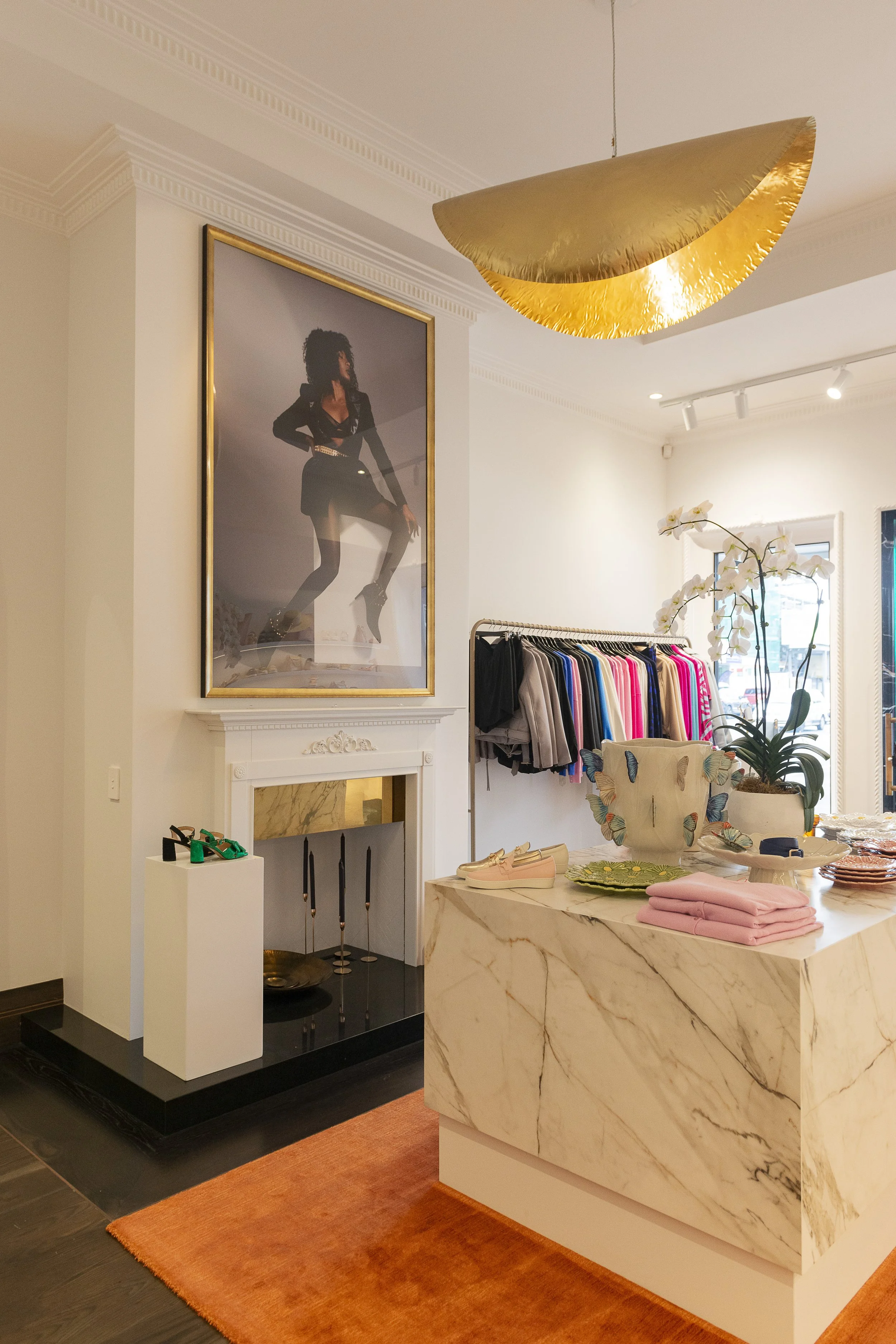
I chose the beautiful Nodi silk/bamboo rug in Marigold to bring in an accent colour, zone the display counter and add softness underfoot. It has a beautiful lustrous appearance that changes in the light. The display cabinet was designed and custom made using Neolith Calacatta Luxe from CDK - this is an engineered stone rather than natural but it has a very realistic veining pattern and I love how the accents of rust tie in with the rug. We were devastated when the delivery crew of eight men dropped the counter on the concrete outside breaking off an entire corner. Not a great day at work! And of course the stone had sold out! We managed to rescue the piece by cutting down the base thereby removing the damaged parts and adding a white painted base.
I’ve always loved the Gervasconi 95/96 brass pendants by Paola Navone from ECC so was very excited to find the ideal space to use them. They come as large flat circles, and when you hang them the thin metal flops over creating these stunning sculptural shapes. We also updated the fireplace surround and added a simple piece of brass sheet metal to repeat the brass around the room. Using the new season’s campaign imagery printed and framed in gold creates large scale statement art that’s actually quite cost effective.
Simple white shelving with rebated LED strip lighting create a blank canvas for the interesting shapes, colours and textures of the shoes, bags and accessories to pop.
This custom made mirror repeats the doorway arch shape and reflects the store’s contents making the space feel larger. Plinths made of wood have been lacquered white to use as pillars showing off the shoes. This chair from Ligne Roset was such a perfect match for the interior we had to have it!
We designed a counter out of black stone for the point of sale area, anchoring it with another brass pendant and adding more statement art.
There wasn’t room for a changing room in the store, but by adding a brass curtain rail and linen curtains customers now have a perfectly private area to try on clothing. A custom made curved daybed adds somewhere to sit and try on shoes. The same rug has been used in this space to add texture and colour but in the brick colourway for more depth.


