Urban Resort / House Reveal
This inner city Auckland villa has been meticulously renovated, carefully restoring the character features while updating the home for modern life. An additional level has been added underneath to house a media room, laundry and third bathroom.
KITCHEN & DINING
This is the existing kitchen and dining space that we freshened up with a few easy design updates. Choosing an overall theme even if it’s just for kitchen styling objects can really help to give you direction when shopping. We chose a palette of blues, greens, pink and purple to create a modern scheme that stands out against the fresh white backdrop. Adding three blown glass pendants added an accent colour to the space and the glass reflects light beautifully. We created a simple countertop vignette with objects of different sizes, heights and textures to add that lived in layer. In the dining space, the Antonia Ferwarda artwork inspires a colour scheme for the rest of the space. Buying a themed dining setting arrangement is really handy to liven up a simple space when you want it to look a bit more special. A centrepiece creates a focal point you can move around the room. A built-in column in the living room housing the TV and fireplace has character molding and skirting to connect it authentically to the room. The floor to ceiling linen curtains are on a double track with a blockout fabric behind.
SHOP THE LOOK Glass pendants, artwork, bud vases, florals, stools, dining chairs, placemats, side plate, dinner plate and bowl, napkin, highball tumbler, paint.
MASTER BEDROOM & ENSUITE
The beautiful Vicki Lee artwork sets the design style for this master bedroom on the top level of the home with beautiful views out to the city. Designed to be a sanctuary for these busy parents, the room features new custom made storage running the entire length of the room with brass inset handles. The ensuite door used to be where the headboard now is - by filling the wall in and moving the door the owners can make full use of the view. A wall cavity was utilised to create a clever little makeup nook with drawers in the base, sides and behind the mirrors. A navy velvet upholstered headboard and base gives the bed a hotel-style vibe with layered bedlinen in a pretty painterly pattern to make the bed a focal point. Grey linen curtains add softness to the white wall while also adding privacy and blocking light.
GUEST BATHROOM
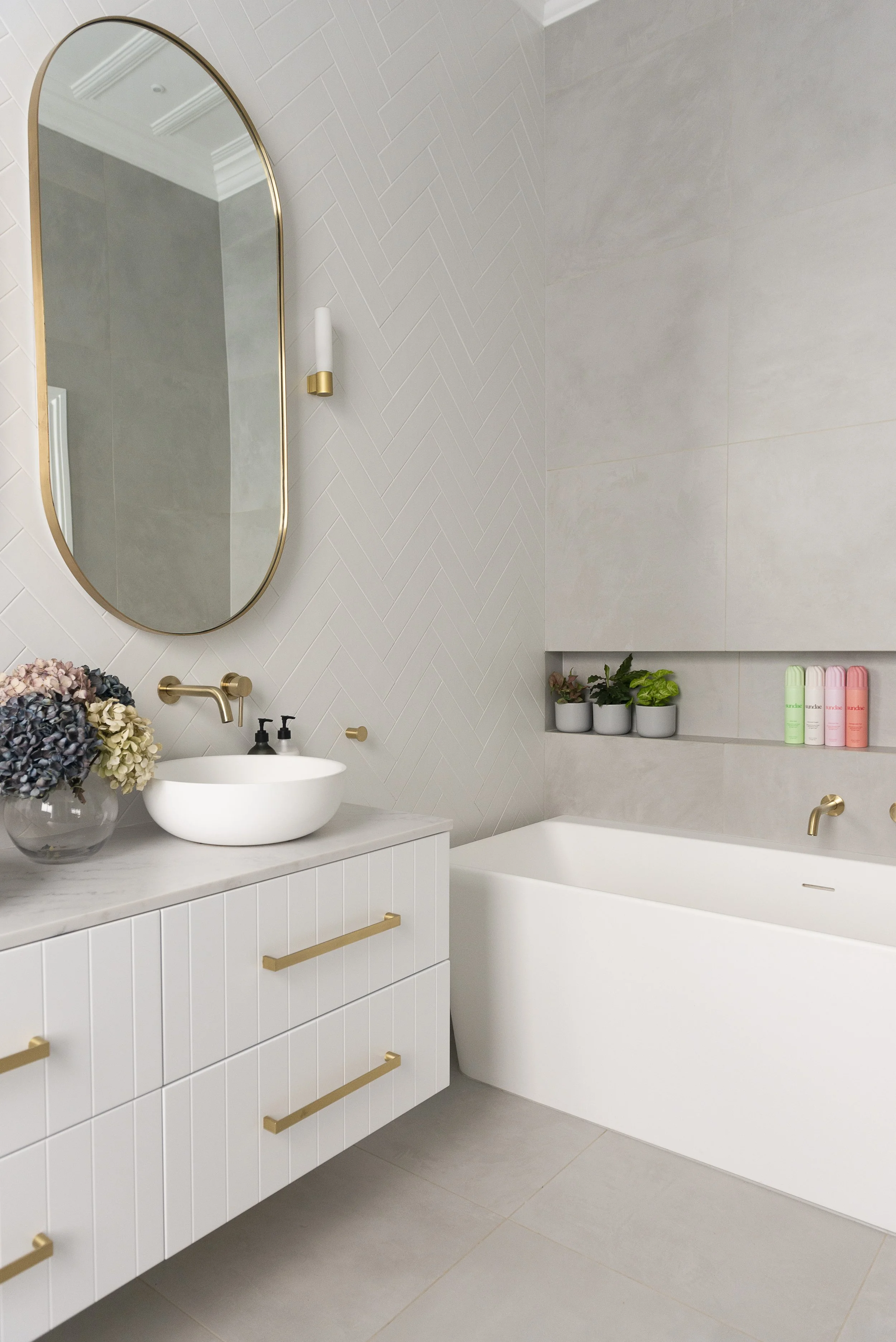
White herringbone tiles add texture to the focal point wall seen from the hallway, and this placement keeps the loo from immediate view! Mixing materials and adding in brass accents adds warmth to the room. The 4-drawer vanity unit has loads of storage space and is wall hung off the floor to create a sense of space. Custom made brass wall mirrors open to reveal sneaky storage behind including powerpoints for toothbrushes. Wall to wall recesses above the bath and in the shower increase storage. Plump Missoni towels in a statement design up the pamper factor and elevate the look, and coloured hydrangeas, plants and products add fun pops of colour.
SHOP THE LOOK Bath, tiles, herringbone tiles, vanity, mirrors, wall lights, tapware, basins, towels.
KIDS ROOMS
In the kids rooms we planned the foundation elements to suit an adult, using character skirtings, architraves, ceiling panelling, grey carpet and grey linen curtains to create a sophisticated base. This allows different kid-friendly themes to be layered on top that can be easily changed over the years. We then selected dusky pink as an accent colour for the girls room and petrol blue in the boys, featuring it in cushions, artwork and accessories. Adding an upholstered bed base, feature headboard and scatter cushions makes the bed into a focal point without breaking the bank.
LOWER LEVEL
Digging out a small garage underneath the home created space for a new bathroom, laundry and media room – and the original garage. Putting the laundry hard up against the left side of the laundry allows for a full L-shape of crisp white cabinetry – hello storage space! Often bathrooms in basements can feel a little colder than those on upstairs levels. Teaming a dusky green vanity and brushed brass tapware with the large format grey tiles gives the room a lighter, brighter and warmer feel. A statement Michael Bond artwork in the media room balances the slate coloured sofa and brings in a rich magenta accent to the room.


