Reveal / Office makeover
There are several adjectives that describe the space that is now my office, before its makeover. But I’ll settle with boring, because it was seriously lacking in redeeming features. Although it was lacklustre, I also saw opportunity. What attracted me to the space was the ideal sized main room, storage room attached to use as a sample library, huge wall of windows letting in beautiful natural light (hello photo studio), and its central position. So I embarked on a makeover to bring the design up to date and create a calm, creative and collaborative space. I’m excited to share more details with you today!
Setting the foundation: herringbone flooring
Flooring really does set the entire foundation for an interior, and in this case I chose to swap out the office carpet for herringbone oak flooring. The timeless allure of herringbone pattern not only adds visual interest but also adds a sense of sophistication and depth to the space. This was important for adding some extra impact in what was an otherwise simple space. I chose a natural oak colour that matches easily with other tones and textures - because this is a design studio there will always be different materials and furniture pieces on rotation.
Adding elegance: wall framing
I like using wall framing or panelling to zone different areas in an open plan space. By adding a different wall treatment and colour, plus placing the furniture central to this area, the area takes on its own identity visually. Adding a large dining table rather than individual desks make this a creative and collaborative zone, where we can talk over plans or materials, have meetings or catch up with clients. The wall panelling was prepared and installed by a builder off a plan I provided. It is actually individual lengths of pine trim, mitred and fixed to the wall to create the look of panels, rather than actual panels. A nice tall skirting grounds the panels, and the walls are painted in Resene Alpaca, a soft, warm neutral that harmonises nicely with the floor.
Adding function: Furniture choices
I often do more of my focussed work at home, and prefer to do the collaborative and creative work in the office. For this reason I chose a dining table rather than desks. The table is from Nick Scali and has a marble top and ribbed oak base, with a squoval top that’s easy to move around. The chairs are by Kelly Wearstler - I love the neutral leather and sculptural bronze frames.
Displaying personality: Wall shelving
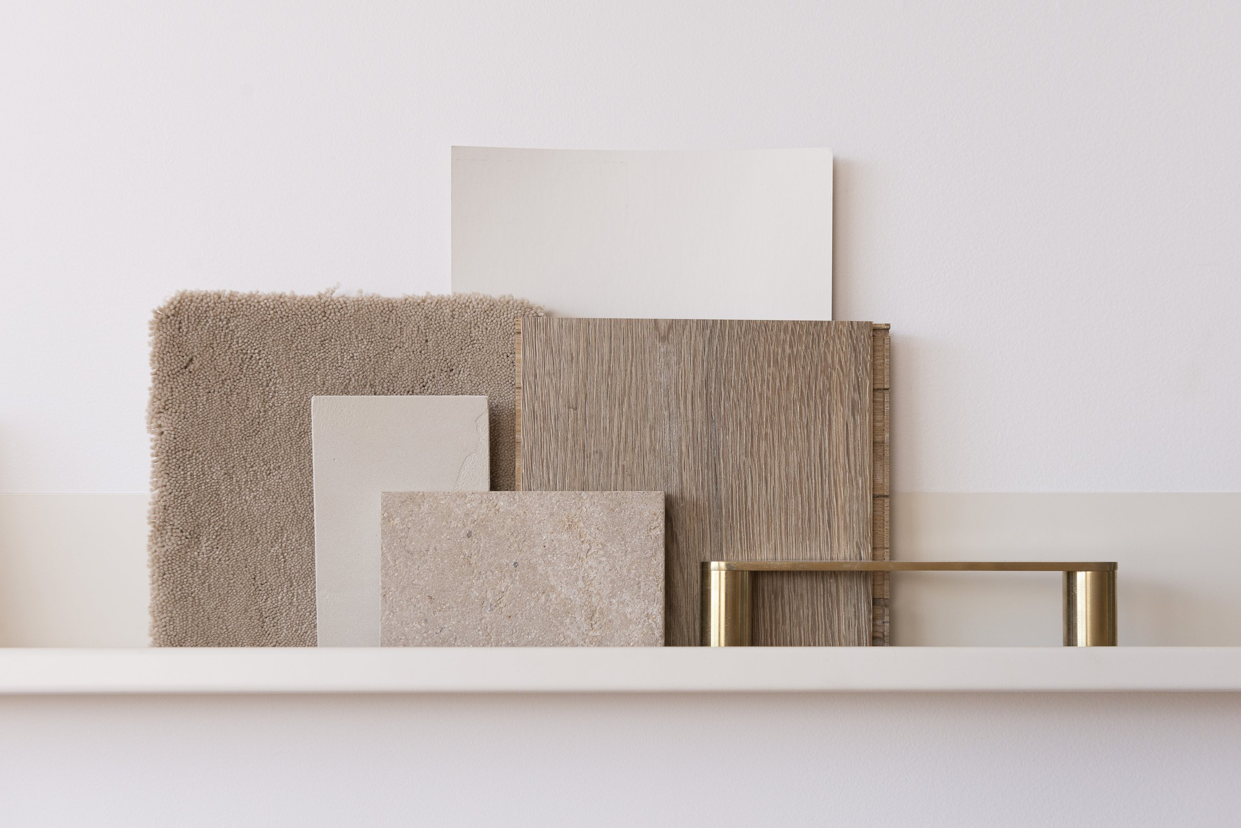
I use curated displays often in rooms as a cost effective and interesting way to decorate walls. These steel shelves are powdercoated to match the wall paint, and serve as a practical and eye catching place to put groupings of samples. For each room on a job, I like to gather a selection of samples and group them together on these shelves, so I can consider them and refer to them over time.
Adding texture: Two-tone curtains
Corporate offices favour blinds over curtains, but I wanted this office to feel more like a living zone. Adding curtains makes the space feel more layered and inviting. I chose to get two-tone curtains made, with one colour matching the wall paint from the main area - Resene Eighth Blanc - and the other fabric colour inspired by the feature wall colour, Resene Alpaca. The window sill line matches up with curtain seam line, tying the two elements together. A modern wave pleat a the top of the curtain keeps the look contemporary rather than fussy and a puddle on the floor adds elegance.
Reimagining art: Making moodboards
For each interior design project I work on, I start by gathering a selection of images that inspire the look and feel. These aren’t all images of other rooms, they are from fashion, architecture, nature and technology. While this started as a part of my design process, I’ve started enjoying the image collections as art and often leaving them on the wall for months. You can do this at home as an easy way of adding life to a wall, also adding frames if you want.


