living room Q&A
This week Newshub and Resene asked me to answer some questions their viewers had sent in about living room design. I really enjoy hearing what areas of the home you are needing help with, and offering advice on simple solutions. Here’s what I had to say!
What are some of the things we should consider when designing a living room?
Watch the traffic flow for a couple of days so you can see how people enter, use, and exit the room. Furniture placement can affect all these things! Depending on your household habits you could set up a more formal furniture setup focussed on entertaining with a sofa and lounge chairs, or a casual room perfect for TV watching with a large modular. Living spaces are often open plan, so you need to consider having easy traffic flow to adjacent spaces while also positioning your furniture to create a welcoming zone. You don’t want to end up with furniture blocking the way to the kitchen, or the sofa position making it awkward to watch the telly.
Furniture choice is so important. When buying furniture start with the large, upholstered pieces like the sofa and chairs. Then use them as direction when choosing the smaller ‘stuff-catching’ pieces like coffee tables and side tables. Think about what design suits you and your family (for instance, are you telly watchers who love to slouch on the couch, or readers who prefer your own lounge chair?). Modular sofas are great for large living spaces and family homes where several people are vying for sofa space, while a three-seater with two occasional chairs creates a more intimate zone. Adding a couple of feature occasional chairs into your living room design helps stop the sofa taking over the space and gives you an opportunity to bring in a more creative furniture shape that reflects your style. Also pick pieces you love but don’t have to be too precious about. And select furniture with details (shape, style, colour) that tie into your interior style.
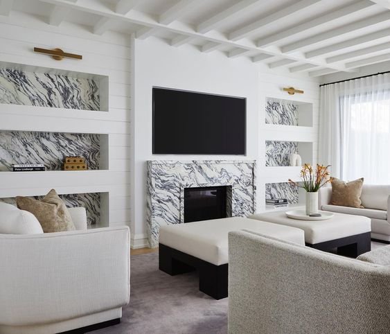
Make use of the vertical space and plan built-in furniture pieces to create visual impact and storage. This could be a column with the TV and fireplace in it, a bookshelf or cabinetry wall around the TV, or a built-in entertainment unit. Not only does this add wow factor, but it also helps to integrate storage and tech which is super important in a living space. Keep tech equipment hidden away within this furniture and consider wiring in or getting Bluetooth music systems sorted. You can also design around the so TV so it isn’t the focus, by adding art or storage.
I want to give my living room a refresh but I'm not sure where to start. Should I look at some current trends to get inspiration?
How exciting! I love doing living room updates. I always assess the flooring and paint to see if they fit the look. If your foundations aren’t the right match for the look you want, chances are nothing else will look right. Investing in updating them first means you’ll have a clearer plan of what pieces work going forward rather than wasting money on small changes. While you can look at trends for inspiration, it’s better to have an interior based on your personal style than someone else’s. Trends are great to look at for inspiration, but closely consider what you like about that trend rather than simply adopting it. Is it the colour or shape you like? Then can you choose your own unique and personal version of that trend knowing it won’t be a throwaway purchase. Next, I would choose an accent colour you love and use that as inspiration for your update. A colour you love can be used for smaller furniture pieces, lighting, art, and accessories that will appear transformative as a makeover but are still cost effective and easy to update when you want the interior to evolve.
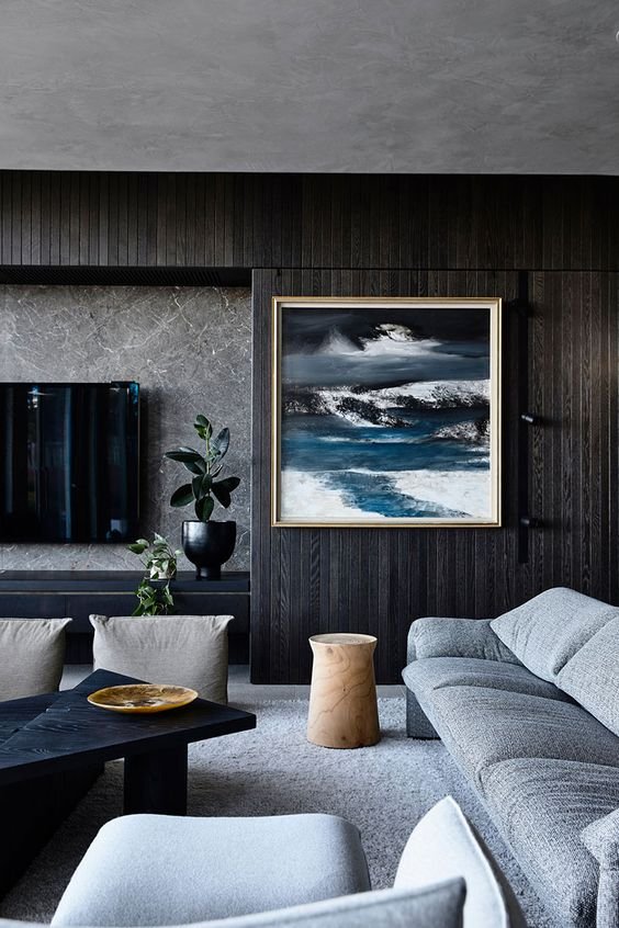
ali budd via pinterest
My living room isn't very big, but we enjoy having people over. What are some of the things I could do to create extra seating without having it feel cluttered?
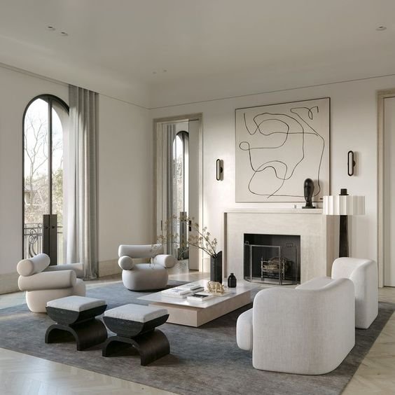
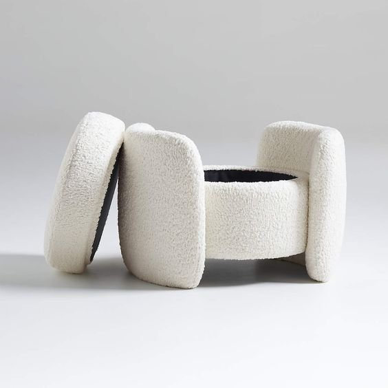
Flexible furniture that can be moved like ottomans or small lounge chairs are a good option. I really like a configuration of a sofa with two lounge chairs opposite and a coffee table in the middle, then on the most open end, a pair of ottomans together. These can be moved around the space depending on who is in the room and can have removeable lids for storage. The lounge chairs can be taken out and put in other rooms like bedrooms at other times. You can also get a coffee table with an ottoman that stacks under the side of it and can be pulled out when needed. I’m not sure how much wall space you have but a slim bench seat along one wall or in a corner can create additional seating that doesn’t overtake the room. This can be freestanding or built in and you can place cushions along the back for comfort. Remember not to have a sofa that’s too big or it will make the room more cluttered. You could also opt for a sofa that’s modular and can be split and moved e.g., taking the chaise end off and placing it opposite when there are people over and you want a more conversational feel. I’ve also seen more folding chairs lately that come in great stylish designs. And you could take inspiration from the Japanese and get some beautiful and comfortable floor cushions designed! Add a low table, candlelight, drinks and great music and your guests will love it.
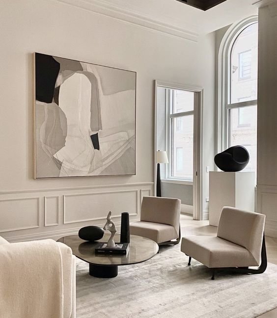
crate & barrell via pinterest
What are your general tips for utilising the space in a living room? How should I have my furniture positioned etc.
Think about who lives in your home, what their habits and how you want and need them to use the living space. Think about the traffic flow in each area before you plan furnishings, and how you can use design to maximise good habits and create different moments or experiences in the room. If you have a decent-sized living room, try positioning your lounge furniture away from the wall. This creates a more cosy, intimate zone rather than an unbalanced room with furniture around the sides and empty space in the middle. Changing the configuration of furniture can really alter how you interact in the room. Group furniture in zones to create areas for your favourite activities, such as chatting, reading, or watching movies. The space will feel more cosy, lived-in, and personal. Some furniture layouts I love to use are symmetrical sofas opposite each other; a sofa and two chairs opposite; one sofa with two chairs either end facing inwards; a modular sofa with occasional chair opposite on an angle; and in a large space the sofa with a console behind as a room divider, then two occasional chairs on the other side. Keeping some flexible furniture like occasional chairs mean they can be easily moved for the space to be used in different ways. Use rugs to define each zone but make sure they’re not too small. The feet of the furniture should sit on the rug by at least 300mm to help ground it, so don’t use a small rug set away from the furniture as it will feel like it’s floating.
Are there any rules I should follow when choosing an appropriate colour palette for my living room?
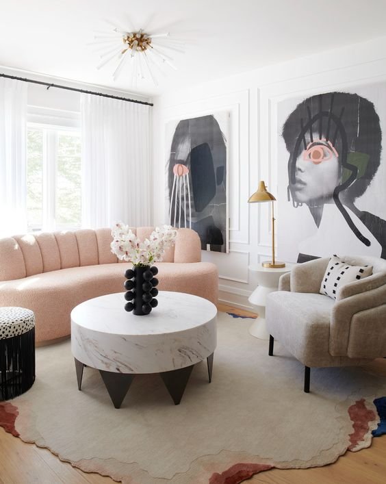
Firstly I consider which direction the room faces and how much natural light it gets. If it’s cold and south-facing it could benefit from a warmer colour, and if it’s warm and north-facing a cooler colour will help neutralise the yellow light (even whites have warm and cool versions). Also consider the size of the space – if you want it to feel larger pale colours generally recede more, and if you want it to feel cosier and more intimate dark colours will advance more. Then think about how you use your living space and how you want it to make people feel in the room. A busy family social space might need to feel more restful, or a cool and quiet living room might need uplifting. I always look at the colour palette throughout the home and choose a paint with a similar undertone. Colour is also emotional, and you need to choose one that will bring you joy every day. So, look at your favourite pieces of furniture, art, and fashion – there might be a natural colour scheme in a rug, painting, or a favourite dress. Pull the colour palette out from that piece — often there will be a neutral, a main colour and an accent colour, which is a perfect combo for interiors! Also, if you’re struggling to work out how to distribute your colour palette around the house or room, try this trick. Use the hue you want to dominate for 60 per cent of the room; the secondary colour for 30 per cent of the room, to provide visual interest; and the final colour for 10 per cent, to sprinkle on some wow factor. So, say your colour palette is warm white, green, and brass. That could translate to 60 per cent white (the walls), 30 per cent green (lounge chairs, cushions, artwork, accessories), and 10 per cent brass (furniture legs, light fittings, candlesticks). This way the colours are applied in a nice rhythm around the room.
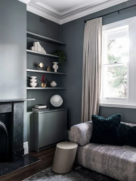
simone haag via Pinterest
What are the things we should avoid when designing a living room? What are the absolute no-gos?
Great question. Getting the scale of furniture wrong is something I often see – usually letting one giant piece of furniture take over the room. Scale is how objects work in relation to a space (or person), and proportion is the shape of an object and how it works in relation to other objects. So, a tiny sofa will look wrong in a large room, and a giant sofa will completely take over a small living room. I like to tape furniture sizes out on the floor and have both a sofa and lounge chairs to break up the space.
Also having all the detail on the bottom third or quarter of the room. If you split your room into thirds horizontally, try to have some design detail in each third. The top third may be ceiling trim, pendant lights or painted walls. The middle third could have the curtains running through it, a built in TV wall, art or wall sconce lighting. The lower third will have furniture. If you ignore the top two thirds the room looks off balance.
Another mistake is not having a main focal point and putting lots of smaller pieces around the room instead. A focal point is the main feature people see when they walk in. It draws the eye toward it, and the rest of the room is designed around it. The focal point could already be there, like a view that you can position furniture toward to maximise. Or you can create a focal point with a built-in cabinetry wall, feature fireplace column or artwork with wall lights either side. You can have several of focal points in a room, but one hero works best.
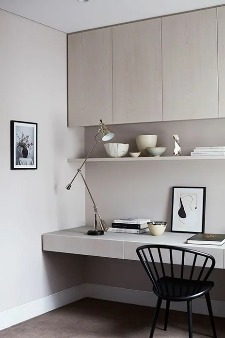
verslutce via pinterest
Could you share the top 3 living room trends, designs, or styles?
Colour
Instead of minimalist and white, we’re seeing rich colours in muted tones like deep sage, ochre, pinot red and warmer neutrals, with colour being applied to ceilings also for a feeling of being totally surrounded. I wonder if after being cooped up so often over the past few years people are wanting to update their spaces, make them feel more interesting, and express themselves more through decorating just like they do through fashion. People are bringing more layers and textures in with soft furnishings to really soften the space.
Multi-use living spaces
I’m seeing lots of multipurpose living room design which I’m loving! I think we’ve realised how our homes can (and at times must) work in multipurpose ways. One living space could have a sofa for TV watching, a daybed or window seat for napping, a small table with poufs for card or game playing, and a set of lounge chairs for having a drink or reading.
studio quarters via pinterest
Curves & nature
There’s so much going on in the world right now that people are seeking to make their living spaces feel more cocooning, welcoming, warm, and safe. I think therefore we are seeing more curved and sculptural furniture pieces and more curves like archways being built into homes – a trend that shows no sign of waning. Rather than go overboard I recommend subtly curved pieces that have a classic timeless appeal. The result is spaces that feel really welcoming and grounding, and curves are also great for small spaces as they’re easier to move around. Add to the welcoming feel by having light sources at different heights and brightness rather than just bright overhead lighting and install dimmers.

