Library wall / Reveal
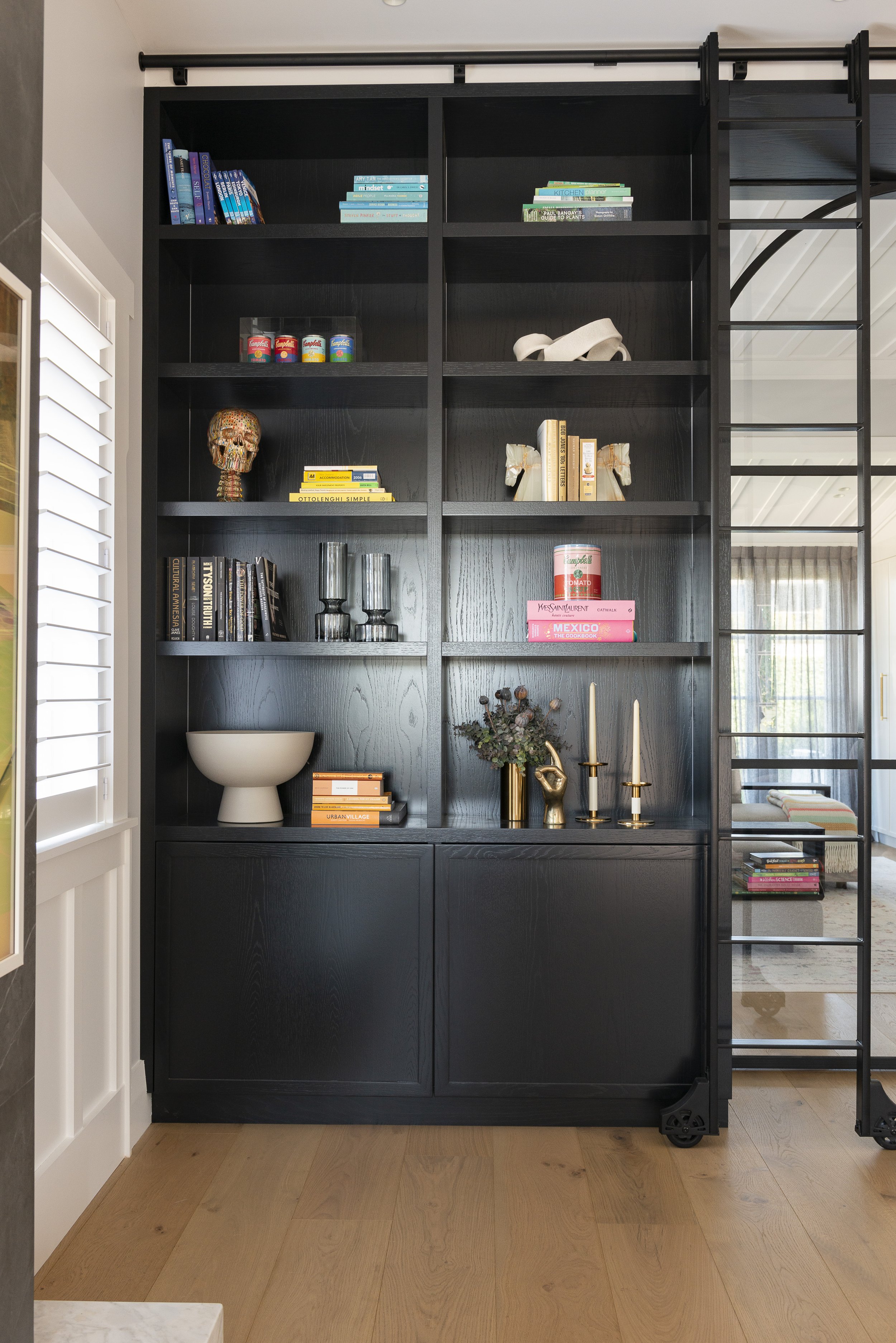
One of the things I love most about being an interior designer is looking at a client’s plans and assessing all the potential design possibilities. My job is to help shape the style of the spaces but it’s also to make sure they’re as practical as possible and work hard for the people who live there. This gorgeous villa has two adjoining living spaces - one for adult and one for kids. My clients had always planned to have a door between the rooms to separate the spaces but also wanted something with wow factor they could use to display collections of books and objects. We decided on a library look and feel featuring shelving, cupboards and Crittal doors. Crittal-style doors are black steel or aluminium, slim frames with glass panels. They were invented by an ironmonger in England in the late 19th century, and have retained popularity globally because of the elegance, contrast and nod to tradition they add to interiors and exteriors. This home features archways in the hallways, so featuring an arch in the double door design is a homage to the original architecture.
I started by drawing up a 3D design to show the clients the suggested size and scale, taking into account practical unit depths and door widths. It’s really important to take people’s collections and belongings into consideration when designing built-in cabinetry, and in this design we combined symmetrical shelving that suits the scale books and objects with cupboards to stow away everyday items they’d rather hide. Full height doors make use of the beautiful soaring 3-metre stud and breaking the door into three framed sections allows the arch at the top to be just the right proportions. I actually drew the design up in both black and white - now I’m so happy we went with the darker version as it’s so much more striking against the white interior. The cabinetry is made from oak veneer featuring a crown cut - a strong grain pattern produced by cutting logs lengthways then slicing each half straight across. Painting this black enhances the grain even more - I love the variation as opposed to a flat black finish.
The design includes a cavity behind the shelves so the doors can slide back and be hidden away to connect the two rooms. The mock-up was sent to Crittal Arnold who detailed and manufactured the steel door design, while cabinetmakers Manolas Bros created the cabinetry and Broswick Builders prepared the space. We included rebated LED lighting strips vertically down each cabinetry column to add a wash of light over the shelves at night. The design also features a steel ladder on wheels - I suspect this will be appreciated more for good looks than actually reaching books!
Overall I’m really happy with the finished result as it adds a unique, interesting talking point to the home, but also an additional experience for the homeowners to enjoy. Adding built-in details to vertical spaces is one of my favourite ways to add impact to a home, and this one combines both storage and style in one!


