Deco delight / Bathroom reveal
This full bathroom renovation takes inspiration from its owner - graceful and elegant with a side of sparkle and fun. I was also inspired by her grand home with its deco curves and her divine wardrobe full of gorgeous clothes including a couple of animal print pieces that caught my eye! The original bathroom was large and well loved but was suffering from dated finishes and lacklustre materials. It also had some plumbing issues permeating it which needed to be rectified before a new bathroom could go in. Thankfully our patient owner can now enjoy her new bathroom - read up on all the design details below.
The soft grey, marble and chrome palette in this bathroom is simple, but the tones are layered in different ways to add more texture and depth. The vanity features a marble top with undermount basins and white lacquered drawers with chrome insets and acrylic handles. The chrome tapware and heated towel rails have a square profile to tie into into the cabinetry inset details. A marble upstand leads up to a full width mirror wall featuring hidden cupboards for additional storage. Marble skirting boards add subtle patterning, and the Osborne & Little Pantanal wallpaper with its animal print pattern features a subtle metallic that adds a luminosity to the room when the light falls on it.
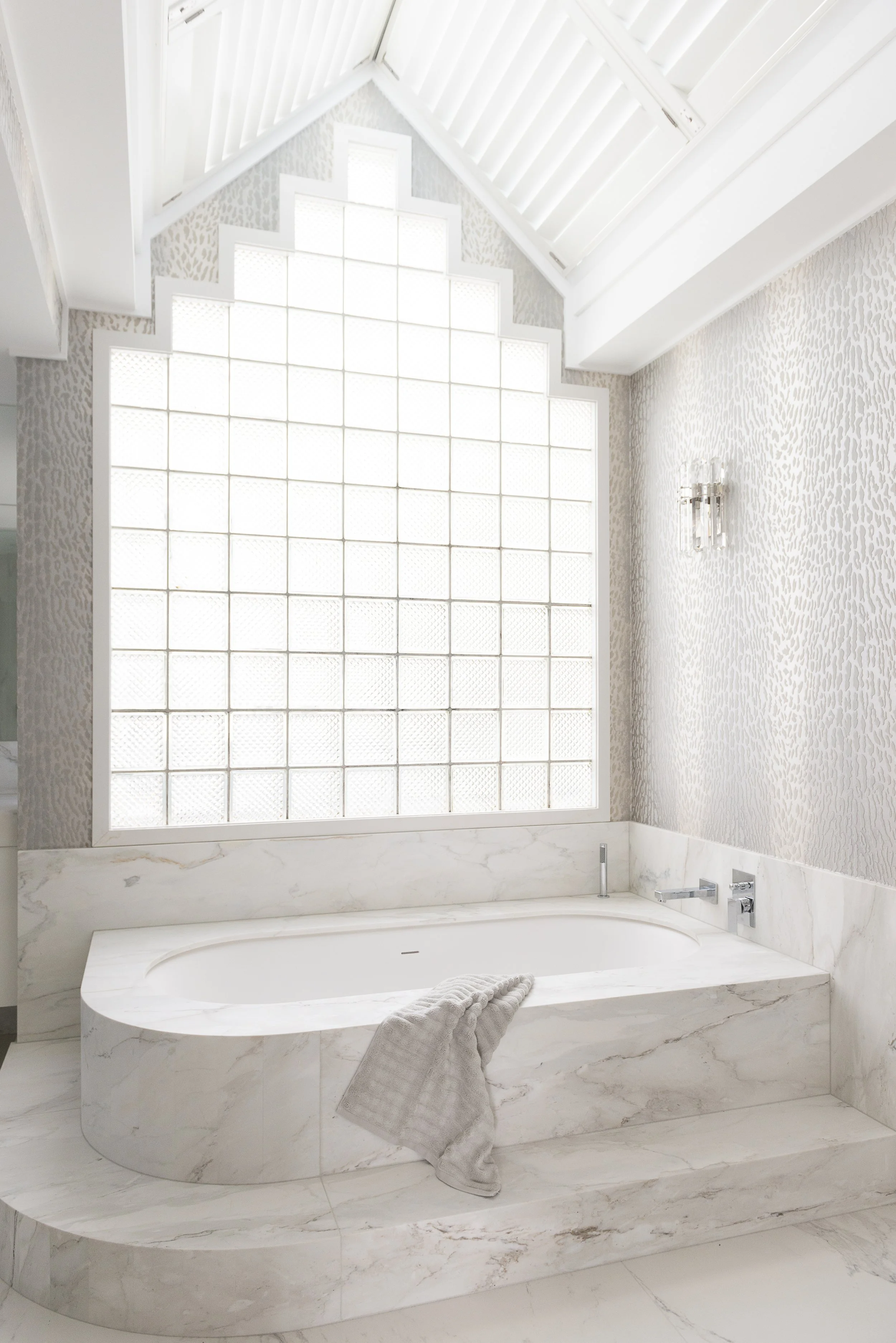
An undermount acrylic bath has been fully cased in marble for a classic, luxurious look. A marble step follows the curve of the bath making the entrance easier, but also making the bath area into more of a focal point. The top of the bath has been cut from one sheet of marble, while the curve is created from several strips laid in the formation they were cut so the pattern continues, and hand rubbed to smooth the edges. Glass blocks and shutters diffuse the plentiful natural light from the windows and skylights. Strategically placed lighting elevates the ambiance of the bathroom including downlights for general task lighting. Crystal wall sconces throw a soft, warm light that accentuates the marble's natural hues, illuminates the space at night and add a touch of glamour by day.
The floor is laid in a more cost effective marble-look porcelain, with real Cremo marble used on the bath, vanity top and skirting boards. This is a good way of balancing costs and prioritising the use of natural stone for focal point areas. Also natural stone is thicker than porcelain, so using natural stone on this existing floor would have changed the floor level and created a step up when entering the room, something I try to avoid. By using porcelain which is a much slimmer material, we could keep the exisiting floor level and create a level transition from the hallway carpet to tiles. The porcelain also has better anti-slip properties than the marble, making it a safer choice in this instance.
The bathroom already had a curved wall which has been embraced to create a large double shower. We used full height porcelain slabs to line the shower and cut these into strips to create the curve, installing each panel in order to continue the veined pattern. A curbed/step entrance is a practical shower option to ensure no water escapes - especially in this shower frequented by the grandchildren! While minimalist bathrooms look great with a curb-less design (the glass going all the way to the ground with no step), I love the classic, framed look a beautifully tiled shower curb creates in a more formal bathroom.
Acrylic and stainless steel handles ensure the drawers are easy to open and provide another layer of visual detail, catching the light beautifully. The acrylic material stops the handles being too solid or dark in this light and airy bathroom.
I love including a tray on a bathroom vanity to group everyday items or special scents - this one is in marble to match the vanity stone. A tightly packed posy of roses is a tailored, elegant finishing touch for the style of the room.
I really enjoy making the toilet area a design feature that rivals the bathroom. The WC was given lashings of TLC with the floors, marble skirting boards and wallpaper continued from the adjoining bathroom to create cohesion. Overall this bathroom renovation has created a light, lovely, practical bathroom with a timeless elegance that the owner can enjoy for years to come.


